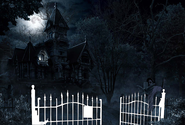
This is the basic Image I got from google.
Now I made certain cutouts and kept them in separate layers for future.
Now i got this image from google and decided to add it.
Made a cutout of the image according to need, a bit of colour correction and placed it in scene. I just unhid the layer on which i had made a cutout of the cross and placed it above the girl layer.
Two more images now.
Placing the images now where I needed them and some bit of colour correction.
Made a cutout according to my requirement.
Time to unhide the layers and place them above the hands.
Now the image which eased out my task . The major part of the poster, the zombies are cutouts of this image only.
Placing the cutouts and applying colour correction
I zoomed in to show the zombies i added on particular area to depict them climbing up the stairs where one looks like trying to climb up the mansion.
I felt need of another one who can be shown going through the gate and have used it in such a way that it cud be shown with one hand on the gate and so kept it below the gate cutout.
Task is almost complete, now just need the text but got these two images and seemed interesting to me.
Cutouts and colour correction as earlier.. The moon might not even make much difference in overall but its adding more darkness I feel.
Finally the text for which I just used some fonts. Gave a dripping effect to the main title.
And that was the Final Output.


No comments:
Post a Comment