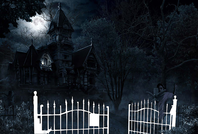
This is the basic Image I got from google.
Now I made certain cutouts and kept them in separate layers for future.
Now i got this image from google and decided to add it.
Made a cutout of the image according to need, a bit of colour correction and placed it in scene. I just unhid the layer on which i had made a cutout of the cross and placed it above the girl layer.
Two more images now.
Placing the images now where I needed them and some bit of colour correction.
Made a cutout according to my requirement.
Time to unhide the layers and place them above the hands.
Now the image which eased out my task . The major part of the poster, the zombies are cutouts of this image only.
Placing the cutouts and applying colour correction
I zoomed in to show the zombies i added on particular area to depict them climbing up the stairs where one looks like trying to climb up the mansion.
I felt need of another one who can be shown going through the gate and have used it in such a way that it cud be shown with one hand on the gate and so kept it below the gate cutout.
Task is almost complete, now just need the text but got these two images and seemed interesting to me.
Cutouts and colour correction as earlier.. The moon might not even make much difference in overall but its adding more darkness I feel.
Finally the text for which I just used some fonts. Gave a dripping effect to the main title.
And that was the Final Output.
Tuesday, July 12, 2011
Sunday, April 24, 2011
Surreal Tree Landscape - Breakdown
Ok Here are the breakdown images for Surreal Tree Landscape. Used pen tablet for the entire process. Do use separate layers for every step, it helps a lot.
Just made a rough sketch of a tree with pen tablet.
Here is a rough squirrel sketch I added on a separate layer.
Added a rough gradient defining the sky and land portion roughly to the lowermost layer.
Painted a sun hiding slightly behind the tree above the gradient layer.
Added a basic colour to the tree and painted sky and land adding details on a separate layer.
Painted tree with a darker shade of brown on a separate layer roughly above the sketch.
This is the benefit of working in layers, Simply hid the sketch layer of tree. If you zoom in the image you will notice a slight yellow tint on the edges of branches and trunk. Did it to add a touch of light. Added grass with the default brush.
Painted colours to the squirrel sketch in different layer.
I guess you can notice the eye now if you zoom in and also that I have hidden the sketch layer. Painted some grass behind the tree.
Painted some grass in front adding detail to the scene.
Added more detail to the grass hiding the bottom of the tree.
Painted some flowers to add beauty.
Using burn and dodge tool added details to tree wrt the sun behind.
Painted leaves at the end of branches on a different layer which adds more detail to the tree.
Adding more surreality to it by painting some clouds above the sky layer.
Added some white flakes to increase the beauty of the scene and this is your final image.
this is not my concept, I found the image on net. Just breaking down the steps of approach.
Surreal Tree Landscape
This is my first try at painting digitally with pen tablet. Do leave your comments and suggestions. For breakdown click here.
Tuesday, April 19, 2011
Sunday, April 10, 2011
Thursday, April 07, 2011
Subscribe to:
Comments (Atom)


